Do The Basic Coloring
As explained above, blending mode Multiply, only affects white areas, while the black outlines stay intact. Now we’ll create a new layer and do the coloring on it.
The first step can be summarized like this. Below, we have the raw material aforementioned.
Then, let’s start to pour these colors (see figure below). All are on Multiply blending mode, with opacity at 100%.
[please click on the image to see larger picture and additional details]
Step 2: Adding Shadows
Now, we need to apply shadows. In this project, I intended the lightsource to be on the right, and a little to the front. So we’ll have to draw shadows on the left part (also remember the body’s 3D contour).
The color we choose here is black, with blending mode Soft Light. The opacity is set to 71%, respectively.
[please click on the image to see larger picture and additional details]
Step 3: Adding Lights
The shades are done. Now, we need to apply lights.
Because the light source is (supposedly) on the right part, we need to emphasize the lighting there. Don’t forget to consider the body’s 3D contour when doing this step.
The color is set to white, blending mode at Soft Light, and opacity at 59%.
Note: Black background is applied below only to distinguish with the white color to be applied. Don’t go with that BG in actual coloring. (~_^)
[please click on the image to see larger picture and additional details]
Step 4: Adding More Shades
We’ll try to apply additional shades. This is done to give more feeling-of-depth to the image.
The color is black again; blending mode at Soft Light. The opacity is at 25%. This value is set on purpose — we don’t want it to overly influence the primary shades, which were done at step (2).
[please click on the image to see larger picture and additional details]
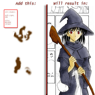
Step 5: Adding a Skin Tone
As in photography, human skin becomes more lively when it has a brown-to-reddish tone on it. So, in this step, we’ll add some brownish tone to the character’s skin.
NB: I chose brown here because I imagined a somewhat-dim lightsource. If you like to imagine bright, white lightsource (e.g. 12 PM sunlight), you may want to use pale red or low-opacity pink.
The color used here is brown, with hexa #61380E. Blending mode set to Soft Light, and opacity at 64%.
[please click on the image to see larger picture and additional details]
And so…
Now our coloring project is done. The final result is as shown above, as the step (5) has been accomplished.
For the sake of comparison, below I have created an image which shows the ‘before’ and ‘after’ picture. The ‘before’ is on the left — while the ‘after’ is on the right side, respectively.
[please click on the image to see larger picture and additional details]
Hmm, is it a far difference or not? Quite a feat in five steps, I guess.
***
And, well… that’s it for this PS tutorial session in this weblog; it also concludes our tutorial session this time. Hope you like it.
See you again, and good-bye — until the end of April, perhaps. It should be time for this month’s session, though.
source http://sora9n.wordpress.com/2007/04/05/photoshop-tutorial-simple-way-for-coloring-m/


0 komentar:
Post a Comment